Ideas, workflows, and product notes from the ResearchViz team on turning papers into visuals people actually read.
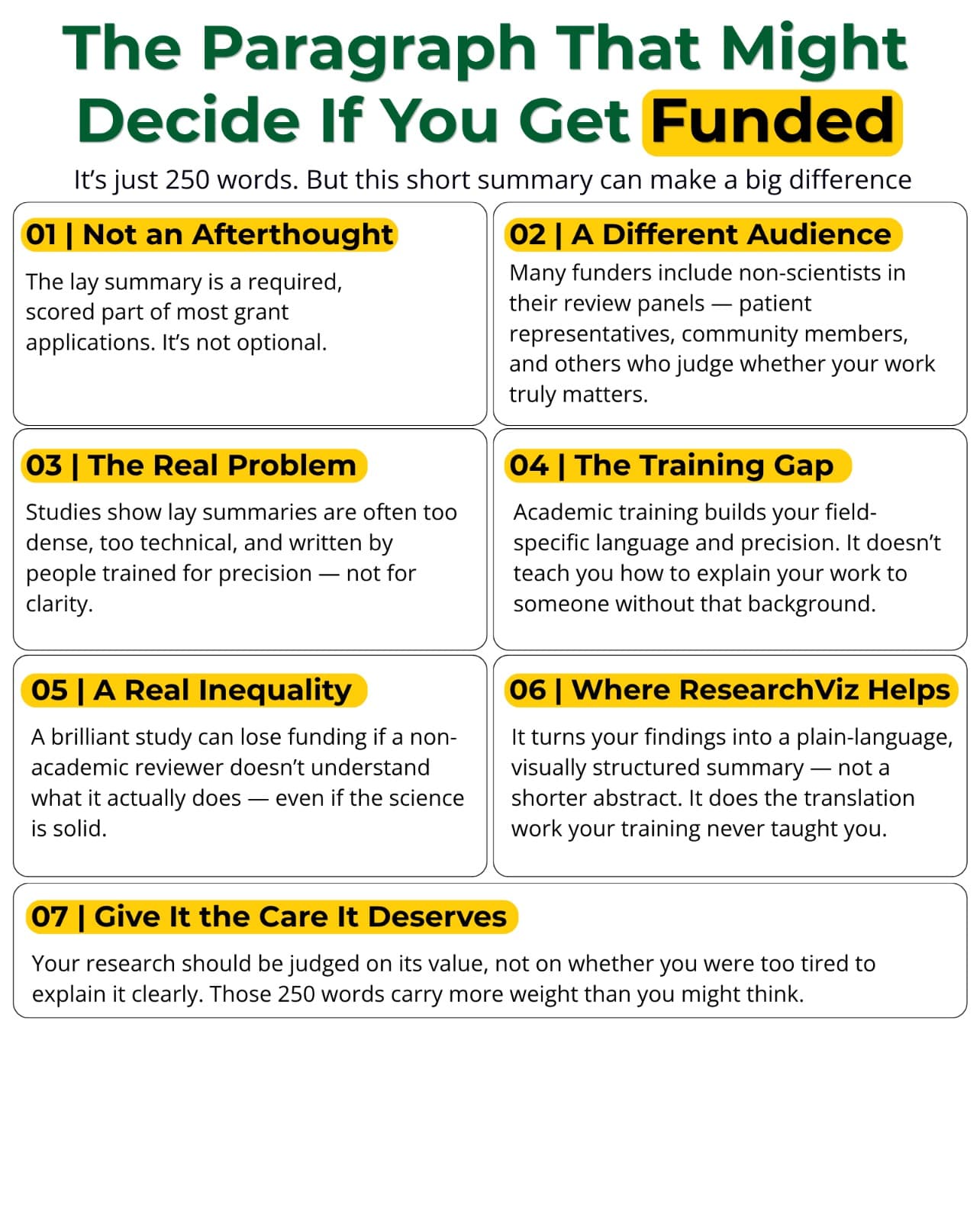
The grant application is almost finished. Aims, methodology, budget, timeline, all of it done and polished after weeks of work. Then you reach the last section. Summary for a general audience. Two hundred and fifty words maximum.
You finished the paper. Every section is written, every citation formatted, every co author has signed off. You reformat the whole manuscript to match the journal's guidelines, one more tedious pass, and you finally open the submission portal ready to be done.
The reviewer comments come back three months later. You open the file already bracing for the worst, and then you read something worse than criticism of your findings. The reviewer did not understand what you actually did.
You open your reference manager to start the literature review section. Twenty tabs are waiting. Some are papers you saved months ago and never opened. Some you skimmed once and forgot. A few you have read three times and still are not sure you understood.
It is 11 p.m., the flight is in nine hours, and eighteen months of work is still a half aligned mess of text boxes. Here is why conference posters break so many researchers, and what actually eats the hours before the deadline.
A single study may need to become a poster, a presentation, a graphical abstract, and a diagram. Here is how AI-powered research visualization brings that work into one connected workflow.